Responsive Web Design & Development
From Phone to Desktop (and everywhere in between)
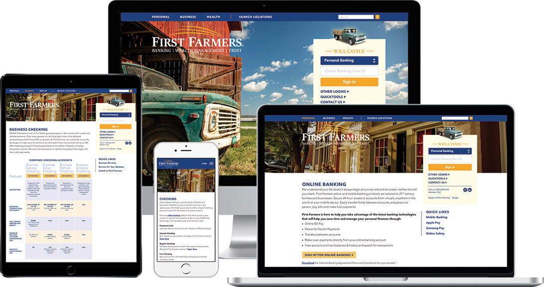
We believe that web design is more than aesthetics. Effective website design focuses on the needs of the end user and includes a well-planned sitemap, a logical and intuitive user interface, and page layout that presents information clearly and consistently. Each component is as important as the next, and only when all of these elements are working together in harmony, can a website design be considered truly successful. By listening closely to our clients and understanding their unique needs, we build websites that are visually engaging and deliver measurable results.
53% of all traffic is mobile
Across the world, mobile traffic has exceeded desktops since 2015
According to Google, 61% of users are unlikely to return to a poorly designed mobile site, and 40% of those users will visit a competitor's site instead. It's not enough for your website to just be 'mobile friendly' — it has to be well-designed and serve your visitors' needs with a thoughtful layout and a consistent user experience. That's where pixelFLYTE comes in. We are big proponents of a 'responsive first' design philosophy. Because we plan for the smallest screen first, we create an adaptive design that allows us to progressively enhance elements of your site as the user's screen size increases. Every website we build follows this principle.
We also develop our websites using standards-compliant coding with open-source programming languages and frameworks. This process ensures a faster, more accessible site that is current with industry trends and best practices. Additionally, maintenance and website updates are more cost effective, and the content management systems we implement are guaranteed to be flexible and secure.